Creative Direction
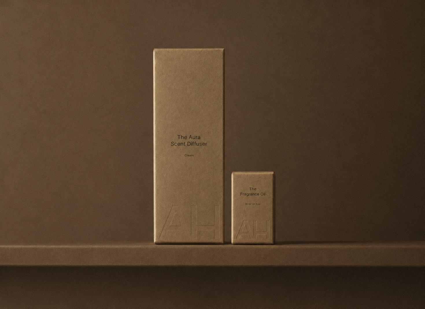
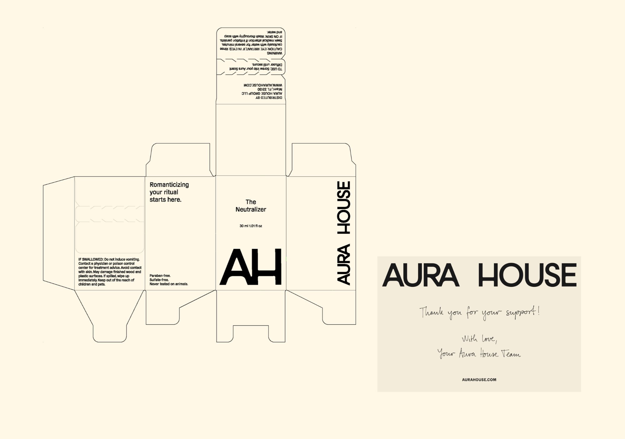
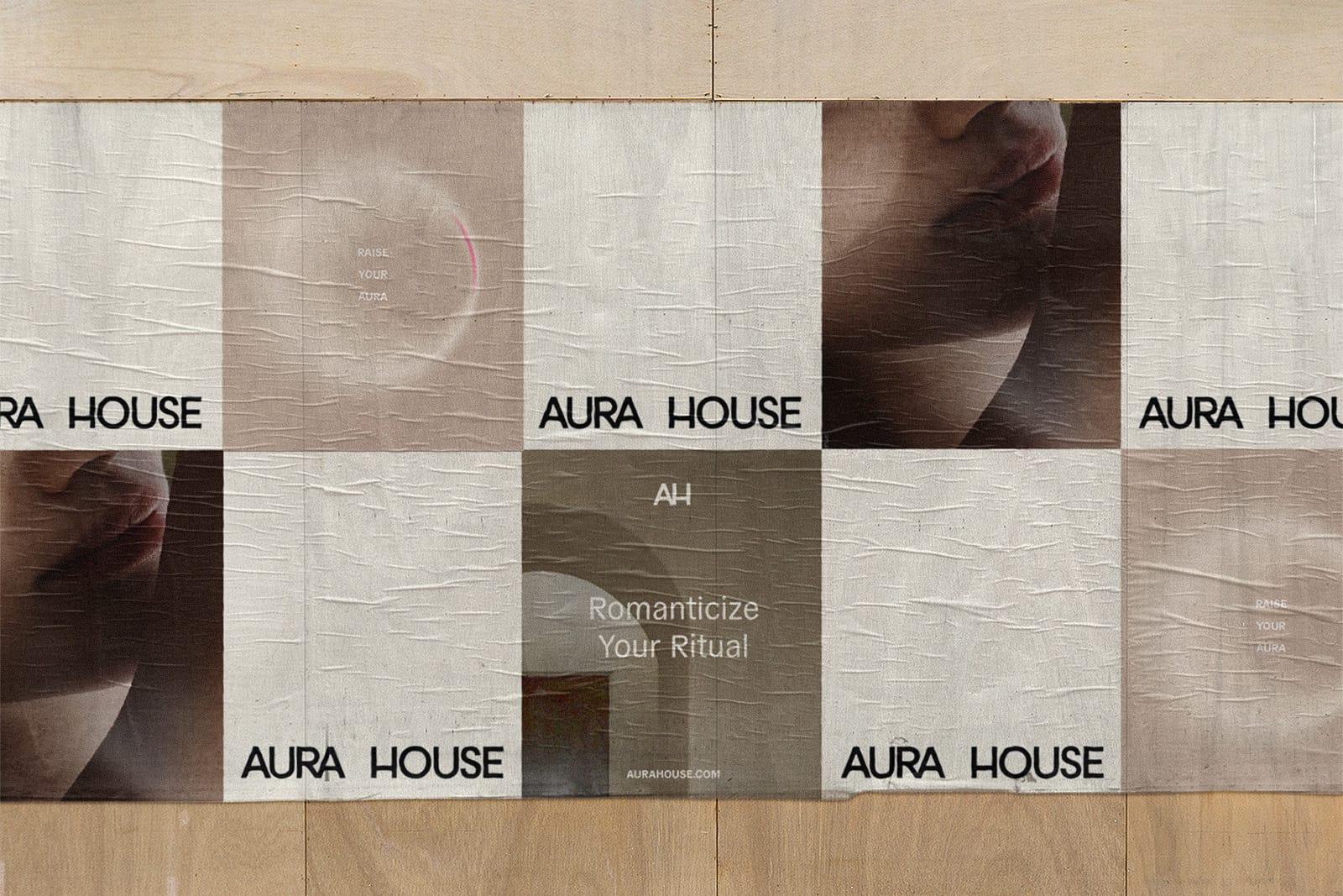
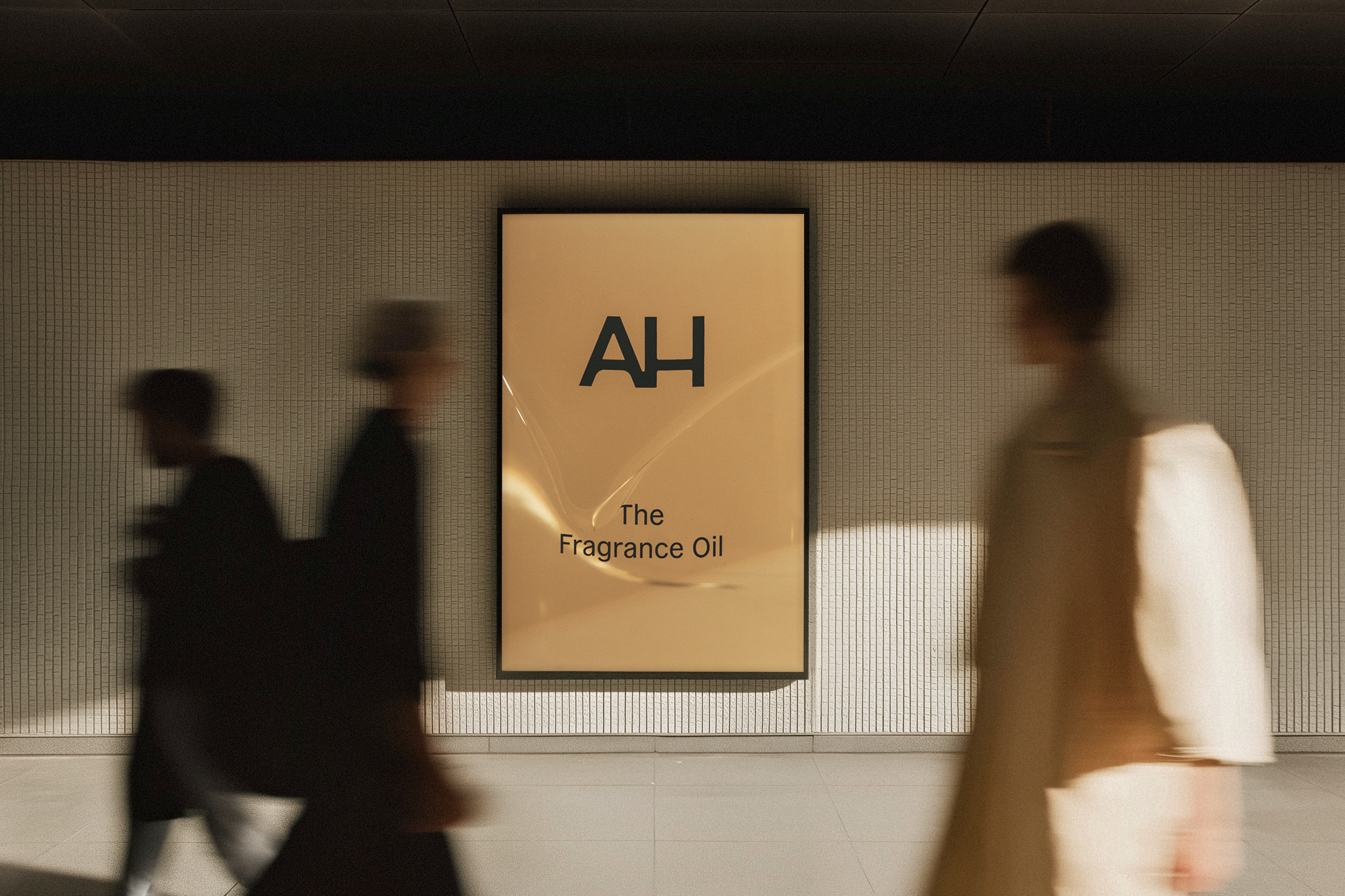
The creative direction drew from quiet luxury beauty brands with soft neutrals, generous negative space, and tactile photography that felt more editorial than typical ecommerce. From our Milanote exploration, we defined a visual vocabulary that was elevated, calm, and architectural, paired with a punchy logo and headlines like “Raise Your Aura” and “Fill the Air.” Collection specific moodboards mapped color, light, texture, and styling so every shoot, layout, and motion asset could reference a clear visual rule set.




.jpg)
.png)