Tulip Health
Project Overview

Tulip Health entered one of the most saturated healthcare categories on the market: GLP-1 based weight loss. In a landscape defined by sterile medical brands and injection-first offers, Tulip introduced a differentiated oral tablet at a competitive price point, backed by venture leadership and medical oversight. Axia partnered as Tulip’s founding creative team, leading the full go-to-market build from brand architecture through digital experience and launch production.

The Landscape

Our competitive audit showed GLP-1 brands prioritizing speed over trust, leaning on aggressive lead capture, cold questionnaires, and clinical or overly soft femtech aesthetics. Experiences were dominated by stock imagery and low emotional resonance, despite the category’s deeply personal nature. Tulip needed to break in with credibility while feeling human, warm, and unintimidating.
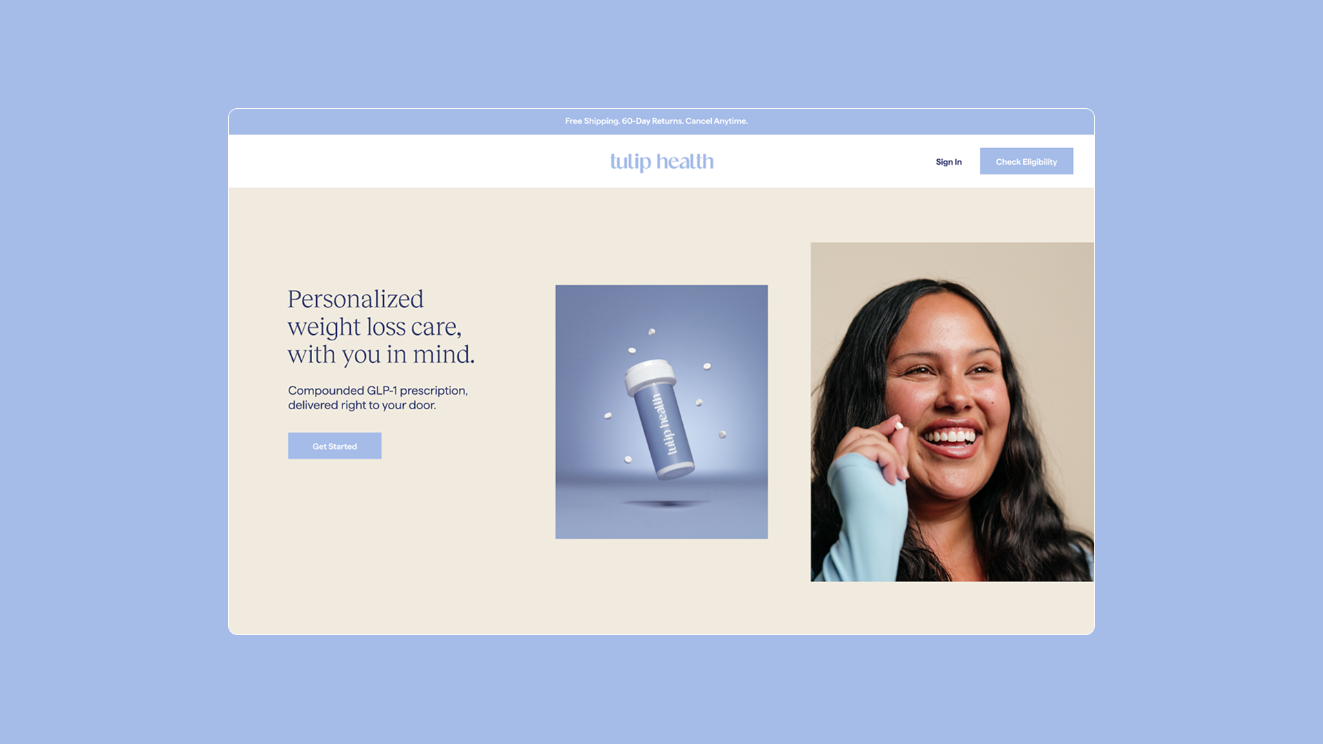
Woman with long hair holding a small pill smiling.

Strategic Positioning

We positioned Tulip around a core tension: prescription-grade care, delivered with compassion. Instead of urgency or “quick fix” messaging, we anchored the brand in safety, long-term balance, and white-glove support. GLP-1 treatment was reframed as part of an achievable lifestyle shift, not a last resort.

Creative Direction

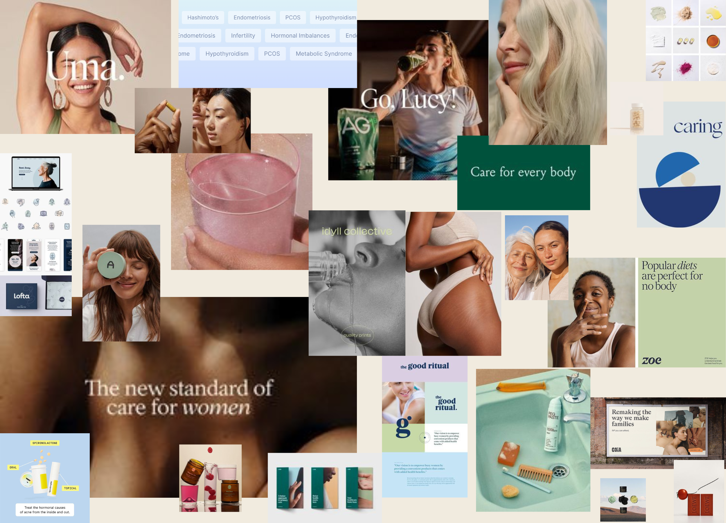
We defined Tulip’s creative direction as the emotional operating system for the brand, transforming a story of hopelessness into one of possibility and self-trust. This direction guided everything from color and typography to UX, packaging, and content, ensuring every touchpoint reinforced calm, clinical confidence. As a result, creative decisions consistently built trust, protected emotional safety, and supported conversion throughout the journey.

Identity System

Tulip’s identity was crafted to hold medical authority and feminine warmth in equal measure. A palette of creams, blues, and grounded purples softens the clinical edge while preserving credibility, paired with a classic serif (Reckless) and a modern sans (Matter) for confident, contemporary typography. The result is a calm, premium, and deeply human brand expression designed as much for psychological safety as for visual appeal.

Packaging

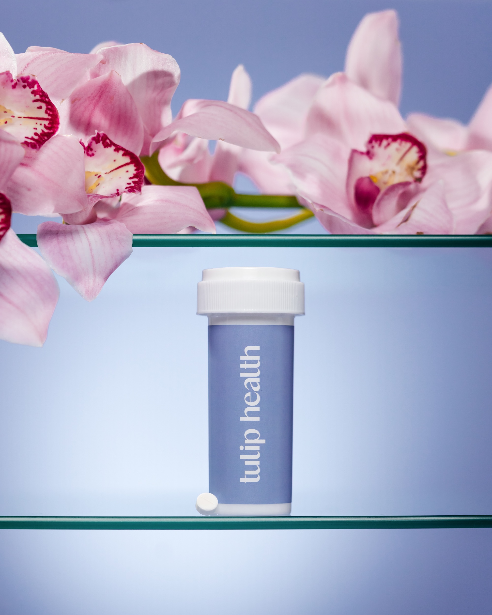
Most GLP-1 packaging leans into pharmacy minimalism; Tulip’s had to signal prescription-grade rigor while living comfortably on a bathroom counter. We developed a system with strong visual authority and a hero color strategy for launch SKUs, allowing product variants to scale within a cohesive language. The packaging feels equally credible in clinical settings and aspirational in everyday life.

UX & Conversion Architecture

Axia rethought the category’s default funnel by designing a guided experience that educates before it captures. The site builds understanding around an oral GLP-1, clarifies pricing and process, and reduces friction in a highly regulated journey. Shorter copy, intentional hierarchy, and elevated media direction keep the experience clear, conversion-aware, and emotionally safe from first touch to intake.

Production & Content System

Authority in healthcare cannot be built on stock assets, so we developed Tulip’s foundational media library from the ground up. Our production emphasized lightness, real women and real bodies, and a balance of intimacy and discretion to mirror the brand’s compassionate positioning. These assets became the engine for web, paid, and organic channels, creating a consistent visual narrative across the entire funnel.